Saturday, August 31, 2013

I've moved


For the past year I've been maintaining my blog on two different platforms, Blogger and Tumblr. To save time and energy, I'll now only be updating my tumblr account. Nothing will change content-wise, as I've basically been posting the exact same material on both platforms for the past year.

Blogspot, it's been real...

Monday, August 19, 2013

New Beginnings


Lindsey and I are finally settled in to our new house across town, which means an all new studio for me to work in! I’ve been so swamped with moving that I haven’t had time to do much more than finish a coloring page, but I hope to be up and running again by the end of the month. 


Attached to the outside of my studio room is an outdoor cat play area (dubbed “catio,” or “cateria”), which my cat Zaylee is just now starting to utilize. Hilarity.


I’m also starting in a new elementary art teaching position within Asheville City Schools this week. This is basically my dream job and I can’t wait to really settle into a classroom I can call my own instead of shuffling around every school year. 

Monday, August 12, 2013

Coloring Book Process- Digital Ink


The final step for finishing a coloring page is to scan the pencil draft and basically trace over it with solid black lines on the computer. The first few pages I made for this project were finished with Micron ink pens, but I found it frustrating to not have the option of editing previous pages as I moved along. The editability provided by the digital tablet really helps in going back and making changes to make a more cohesive body of work. 

I use a Wacom Intuos 5 (the large size helps in creating more gestural drawings) with my disappointing HP laptop. I hope to replace my computer soon with either a nice big iMac or a Macbook Pro with an additional monitor. I definitely feel the limitations of my puny 13" screen, especially when I have multiple tabs open for image research on Chrome and all the Photoshop palettes and layers to switch between.


I'm still using Photoshop CS3, which seems to work fine for the relatively simple tasks I use it for. I'm hesitant to make the switch to the subscription-based Creative Cloud, just because I don't feel ready to pay $20 a month to basically rent software. 

If you look closely at the image below, you can see the pencil draft underneath the dark black lines. The main goal in the final step is to clarify my pencil draft and to add crosshatch and texture to give shape and detail to my figures. I do miss the feel of working with real ink on paper, but can't say I want to go back to constantly redrawing my pages just to correct a few stray marks.


Monday, August 5, 2013

Coloring Book Process- Pencil Draft

I finish all my coloring pages with my digital drawing tablet, but I prefer to get a solid rough draft done with pencil on paper. I use a 9x12" (slightly larger than the published size) smooth bristol paper, which holds up to a good deal of erasing and reworking and can take ink reasonably well if I decide to draw with pen for extra clarifications.


I begin by referencing my thumbnails to lay out a basic composition of the page. Later, I reference my creature design sketches and notes to slowly refine each detail of the drawing. It's always better to work every aspect of the page bit-by-bit instead of completing the subjects one-by-one. 

Each of the frames in this little animation are scans I took every 15 or 20 minutes. I know that I'm finished with the pencil draft when each area of the page has been at least vaguely established, but by no means a polished product. In my next post I'll share my process for finishing the page on the computer, and it will be apparent then just how much even a relatively complete pencil draft can change in the final step.

Friday, August 2, 2013

Coloring Book Process- Composition / Layout

Once I've arrived at a creature design that I'm happy with, I do a series of very rough thumbnails that give a basic sense of setting and provide a layout of the page.


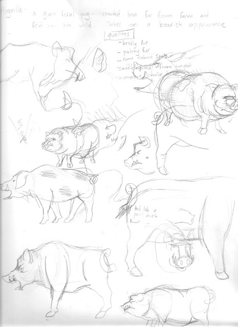
With the Hogzilla page (basically a massive hybrid between a feral pig and wild boar) the goal is to make him look large in comparison with his surroundings. I really want to convey the sense that this creature lives a sedentary life, so I want to minimize any motion in the image. Because of this, the pose is fairly straight forward- just a massive pig standing in the forest. My challenges here are mainly drawing the forest differently than all the other pages that take place in similar environments, and to making the image dynamic without relying on action. 

I'll get technical now with some crudely drawn football-play style arrows over my art:


I liked this thumbnail the best, so now I'll explain why. The pig is separated by the background due to the upward motion implied by the far-off tree trunks. He's also framed by the horizon line and the bouncy line made by the foreground honeysuckle bush. These lines will act to trap the viewer's eye in the center of the image. Additionally, the facial details will initially pop out just because we're always looking for eye contact.

Since that's a relatively simple composition, I'll show how the same principles work with a more dynamic page: The Skunk Ape.


This guy lives in a very chaotic environment. Swamps are known for their impenetrability and pervasive vegetation, so it was a challenge to make sure the main subject stood out. Starting from the bottom of the image, the half-submerged branch and duckweed point the eye right toward the ape. The shore in the background achieves the same result. Finally, the large tree trunks in the background work as a border for the focal point of the image.

In the end, it's all about making sure the main subject pops out at first glance, even in cases when the background has a lot going on. Next week I'll share a timelapse of my Hogzilla pencil draft being completed.

Wednesday, July 24, 2013

Coloring Book Process- Creature Design

I've been busy with summer travels and moving to a new house across town, so I haven't been able to churn out the coloring pages like I was earlier in summer. I thought I'd use the slowdown as a chance to show my creative process for making a coloring page.

I begin each page in my sketchbook, where I take notes on my research and begin sketching out the look I'm going for. The goal is to become familiar with the anatomy of the monster and to create a look that gives clues as to the scientific / evolutionary rationalization for their existence. My guiding principle in designing each cryptid is to steer legends based on magic and myth into the realm of science and logic.  This step is the most exciting and also the most intimidating, as each beginning requires me to learn to draw a new set of anatomy and come up with a unique approach to what are often very well-known legends.


These drawings are very rough, as I almost never erase a sketch if I don't like how it turned out. I feel it's more important to see what DOES work along side what DOESN'T to arrive at a more refined final product. It's a bad habit, but I often move on from this step before it's finished, which just creates headaches as I work on the final draft without a solid foundation for the pose and anatomy of the creature.


Tuesday, July 16, 2013

Cryptozoology Coloring Book- Mini Edition


Troy (of youwithrhinestones.com) and I just got done running off a 12 page edition of my coloring book.
Gotta say how exciting it is to see my work finally in book-form and to be so close to completion on this project. The full version will have 26 pages and likely be finished in mid-August.

Monday, July 8, 2013

Cryptozoology Coloring Book Cover and Logo Designs


Ventured into some design work today and came up with a cover and logo that I'm pretty happy with. I'll be printing a shortened version of the book with 12 cryptids to sell at ZaPow's Artist Demo Day, where I'll be working on inking a coloring page on my tablet & PC. Starting to get really jazzed about this project now that I've got a decent handle on how I'm laying out the pages and making my artwork into a physical product.


Wednesday, June 26, 2013

Cryptozoology Coloring Book- Sea Serpent / Caddy


Cadborosaurus willsi or Caddy is the name given to some unusual remains found in the stomach of a Sperm Whale in the 1930's. The elongated corpse is often connected with old myths of massive sea serpents inhabiting the open ocean. 

If this looks familiar, it's because I basically ripped off my earlier Adrift ink painting to save some time. Why reinvent the wheel?

Monday, June 24, 2013

Friday, June 21, 2013

Cryptozoology Coloring Book- The Dover Demon


Back on the horse with my coloring book! Hoping to use my summer months to conquer this project and minimize the distractions of recreating and other art ideas.

The Dover Demon is a creature that was spotted on 3 occasions around Dover, MA. It's description is difficult to match to any terrestrial animal, therefore it's often thought of as an alien. This is by far the strangest creature I've depicted so far, and likely the furthest from scientific reality I'm willing to venture. 

Tuesday, June 11, 2013

Rampage AVL


Check my feed for a description of the process. So glad to have some time to focus on my illustrating now that school's out for the summer.


Sunday, June 9, 2013

Rampage AVL- simulated watercolor technique

Here's a quick walkthrough of my coloring technique for my parody of the Rampage arcade game. Since I chose to do the line art digitally, the challenge became to color the piece in Photoshop in a way that simulated watercolor. Nothing beats the look of real paint on paper, but since the drawing was born on the computer I found this approach to be a worthy substitute.

Here we go...


1.) I painted several pages of watercolor paper with a wash of india ink and scanned them into my computer.


2.) Using Photoshop, I sliced up samples of the ink-wash scans and placed them in separate layers underneath my line work. It looks like an overly complex patchwork of values, but each subject of the illustration actually has its own unique texture and direction of brush marks.


3.) I switch the blending options on the ink layers to multiply and create a new layer for color underneath. The flat color from the Photoshop brush and the black and white ink wash combine to create a pretty nifty simulation of watercolor paint. 


Tuesday, May 28, 2013

Classroom in motion

A series of still images strung together. I took a picture from (more or less) the same place in my art room after each class for about 2 weeks.

It's fun to focus on an individual object and follow it around room. Try the door, the palette on the marker board, or any of the baskets on the work tables.


Wednesday, May 22, 2013

Rampage AVL- Progress

George from the classic arcade game Rampage taking out Asheville City Hall. This is just a small chunk of the piece I've been working on this past month. 

It's been a significant effort to get to this point on this drawing, mostly because I began it with pencil and square ruler and switched to Photoshop and tablet halfway through. A wise decision in the end, but time consuming nonetheless.

I'm planning on printing a copy of the line art and coloring it with watercolor or gouache for the "original" piece, and having a separate look for the print version. More on that later.


Tuesday, May 14, 2013

Living Rock Growth- 2013

Another time-lapse of my Lithops plant growing earlier this Spring. I snapped a shot just about every day for 2 months during it's annual growth cycle.


You can see last year's growth here. Even though it seems to be growing quickly, the plant hasn't changed its overall size much over the 3 years I've kept it. Instead, the new growth draws water from the old "leaves," which shrink away like tiny raisins.

It was challenging to remember to take the picture at the same time of day or under consistent light conditions, hence the wide variation in brightness.

Thursday, May 9, 2013

Ray Harryhausen

I was saddened to hear today that Ray Harryhausen, the great stop motion animator behind Clash of the Titans and The 7th Voyage of Sinbad died Tuesday at the age of 92.


I made this drawing in November to pay tribute to his influence on my creative life, and it's based on a scene that has more responsibility for what I do and what I'm about than anything else I can think of.

Wednesday, May 1, 2013

BCS Art Show


My day job has been eating up a lot of my free time these past few weeks, so unfortunately I haven't had much energy to chisel away at my coloring book project. With the drawing time I do have, I'm giving myself a brain break and revising and digitizing some earlier pages. I'll be back with some new art later in the month.

Fortunately, my day job is pretty awesome, so I'll be posting some more images related to my work as an art teacher at an Asheville elementary school.

Here's some pictures of the Buncombe County Schools Art Show, on display at the Asheville Mall until May 5th. Every elementary, intermediate, and middle school art teacher in the county was given a large bulletin panel to highlight some of the best art made in our classrooms. My school is K-4.

3rd Grade- Acrylic on canvas


2nd Grade- Hybrid animals


2nd Grade- Blue Ridge Mountains


1st Grade- City skylines


K- Dream house

Friday, April 12, 2013

Podcast Interview

Illustration and a Beer - Episode 14: The Cryptozoology of Bluegrass

Here’s a link to my podcast interview with the folks at ZaPow, the Asheville gallery where my work is on display. It’s a nice long and meandering chat about my process and artistic interests.

Wednesday, April 3, 2013

Brand New Chew / Other New Prints On Sale!

I've updated my online print shop with some of my newer artwork, including a revised version of my top-selling Big League Chew. 

Check it out:


Sunday, March 24, 2013

IG-88


Digital drawing

I used the IG-88 boss battle from Shadows of the Empire on N64 as an inspiration for this. This whole level involved taking a train through a junkyard world, and ended with an intense battle with this guy, filled with odd robotic vocalizations and pulse weapons.


In case you missed it, I did a whole series of posts on the process for making this. You can check my feed to read up on each step, or just watch it all unfold in the gif. 

Saturday, March 23, 2013

IG-88 Process- rough colors


All the basic colors filled in without any shadows or highlights. I went into this hoping to just use four color tones, but it ended up not being enough to define all the chaotic figures in the foreground. 
Once again, a large purpose for this project is to start to develop a style for digital coloring and drawing. A large inspiration in this endeavor is the comic art of Francesco Francavilla. I really enjoy his use of contrasting neutral colors and flat tones over complex gradients and effects. 


(rejected color scheme)